|

Vampire Solstice -
The Book Cover Design
An article about form and function in an original book cover design for the
vampire novel, Vampire Solstice.
by Silvia Hartmann
I am in the wonderful position to write my own books, control the editing
process and also the cover designs.
That is a wonderful place to be, indeed it is.
I would like to take a moment to thank YOU, dear visitor, personally, and I
really mean this from the bottom of my heart, because it is YOU who is
making this possible.
When I was younger, and there was no such thing as self publishing at all,
and no Internet to reach individual people on a shoestring budget, an author was
left to the tender mercies of THE PUBLISHERS.
Ouch!
Now I don't want to insult real torture victims with a comparison, I really
don't, but on the creative front, there is simply NOTHING more painful and
hideous than when some MUPPET editor who doesn't give a fig for what you're
trying to do mutilates your words, your expressions, the energy of your work and
your message; and then the whole thing gets compounded into a dreadful mess as
some illustrator who likewise doesn't give a damn or doesn't understand the
first thing about your intentions for the work cloaks it in nastiness.
So you've written a book, you know what you're doing, you LOVE IT, you are so
proud to finally get it published - and you are presented with this awful
travesty, this dreadful mutant horror and THAT is what the general public is
then shown and told, "That's HER work."
It is absolutely awful, and if you haven't been through this, thank your
lucky stars. It is TERRIBLE.
So you can see now just why it is so important to me to keep control over
things like the jacket design of a book.
And who better to know what is inside than the author themselves?
Sure, we've got all these "commercial considerations" - what'll sell on a
supermarket shelf for a dollar right next to the latest cook book or
ghostwritten nonsense by some five minute fame "celeb".
For literary fiction and integrity, those are the death tolling bells of
doom.
And it's totally unfair to the reader, as well.
Even though you should never judge a book by its cover, it IS the cover that
draws the eyes and frankly, lying on the cover as to what the content is about
(by putting a naked girl with her legs apart on front of a literary novel about
soul loss, just so we sell a few extra copies and make a few more bucks!) is
once again, a DREADFUL thing.
The people who buy the book with the lying cover will be disappointed and
angry with the mismatch in promise and actual content; the people who would have
liked the book and would have been the right audience would have walked on by
and never got to read it at all.
And once again, it's the AUTHOR who gets blamed and who'll get all the flack.
You can tell I'm angry about this whole deal, right?
Damn right!
So thank you again, dear person reading this, for it is you and your kind who
buy books DIRECTLY from us, and thus have enabled ME to have the editorial
changes the way I want them to be, the title what I want it to be, and the cover
to be what I want it to be.
Now, we have a BOOK that is representative of what the author intended - the
magical "author's voice".
Fair enough - I might not sell as many books by bringing all of that into
alignment and have it be one single thing that all sings the same song; but when
someone buys one of these, they will be right people, and I'll be happy, they'll
be happy, and it's been done right and as it should have been.
Now, to the design for Vampire Solstice.
This is a book about vampires, yes, but not your ordinary kinds of vampires.
My vampires are different from others in one important way - they don't drink
blood. They don't have bodies, they are an energy system walking around without
the flesh in essence.
Still, they need to feed on the life essence of humans to survive their
transition; and still, they WILL take your blood - only, they will also take
your flesh, bone and all the rest of it in the process of the transformation.
Clearly, we can't be having an image of a traditional vampire on the front of
this book, for that would be misleading.
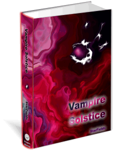
My vampires are souls that live and fly in "the oceans of energy", and they
are essentially alien; so I represented this by the white, ghostlike presences
that come from the black void at the top right of the image.

As this is a book cover, and as an image, will thus be read from right to
left (front first, then you pick it up and turn it over) in the opposite
direction to how one would normally look at an image, the developmental timeline
on the image is also reversed.
These souls come from the void, they travel into the red space of flesh and
blood, and then beyond that into the dreaming world, and then into the wider
universe of nature, if you will - that is the story and progression of this
painting.
It is abstract because I tried to capture the essence of "flowing forward"
which is so central to the lives of my vampires; they develop all the time and
move from one stage to the next.
I think I managed to convey with the cover clearly that if you are looking
for a classic crosses, wooden stakes, garlic, blood'n'gore "Dracula" type horror
novel, this isn't it - but if you are fascinated by mystery and interested in
the ESSENCE of transformation into an immortal being that feeds on others and
develops in an alien way, you're right at home with this vampire novel.
As with all art, with this cover I have done the best I can to make an idea
be visible; to transmit a certain kind of energy that calls to the RIGHT people,
to those who have a resonance to this and who'll understand it, enjoy it, gain
something from it.
How well any human attempt at art ever succeeds in that, well, that's one of
those things.
But at least I, as the creator of this vampire world, I feel that there is an
energetic congruency between the form and function of the book, and its cover.
I'm happy with this, and I'm proud to put my "nick" StarFields under it, and
have it go out to many other people who will judge *me* as the author by the
book, and by its cover.
At least now it's fair, and they can.
© Silvia Hartmann 2006
|


